How to Enable Dark App Icons on iPhone With iOS 18
Apple now offers more Home Screen customization options. Users can personalize and Enable Darker App Icons With iOS 18.
How to Enable Dark App Icons on iPhone With iOS 18
Did you ever glance at your phone in a dim room and get hit with a wall of bright white light? It is a jarring experience. We have relied on Dark Mode for years to soften the glow of our menus, but our app icons often stayed bright and colorful. Learning how to enable dark app icons on iPhone with iOS 18 is the missing piece to a truly consistent interface. Apple finally addressed this, giving users a way to make their home screen look as smooth as their settings menus.
The evolution of iPhone design has been a long road. We started with realistic, glossy icons and moved toward the clean, flat look we have now. Users have been asking for more control over their personal space for years. Dark Mode was a huge step in the right direction, but the "bright icon problem" always stuck out. Now, with iOS 18, Apple allows those icons to dim down right alongside the rest of your system. This change is not just about looks. It is about creating a cohesive space that is easier on your eyes and saves a bit of battery power along the way.
Understanding Dark Mode and How to Enable Dark App Icons on iPhone With iOS 18
Dark Mode has been part of the iPhone experience since iOS 13. It changed how we interact with our screens at night. By switching the color palette from white to deep gray and black, Apple made late-night scrolling much more comfortable. iOS 18 takes this idea further. It does not just change the background of your messages or emails; it now touches the very face of your apps.
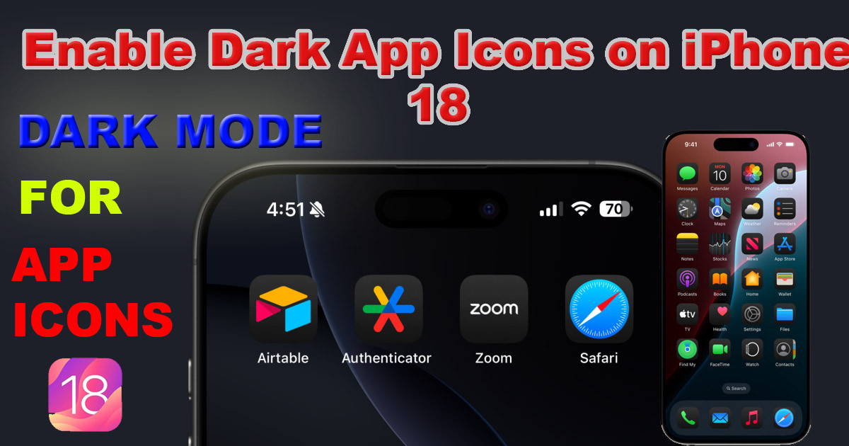
When you turn on the dark icon setting, your iPhone automatically applies a darker filter to your home screen icons. It does not just wash them out. It reinterprets the design so that your most-used apps feel like they belong on a dark background. This creates a unified look that feels intentional.
You might wonder if developers have to do extra work for this. The answer is both yes and no. Apple built a smart system that can tint icons on its own, so even apps that are not updated by their developers can still look good in dark mode. However, developers who create custom dark assets for their icons will provide a higher-quality result. Either way, the system handles the heavy lifting so you get a consistent look across your device.
Steps to Enable Dark App Icons on iPhone With iOS 18
Activating these features is straightforward, but it requires navigating a few menus. You need to ensure your global Dark Mode is on first. Then, you can toggle the specific icon setting. Follow these steps to get the look you want.
System-Wide Dark Mode Activation
Your phone needs to be in Dark Mode for the icons to take effect. If you have your phone set to change based on the time of day, this will happen automatically. If you want to force it to be dark all the time, do this:
- Open the Settings app on your iPhone.
- Scroll down and tap Display & Brightness.
- Under the Appearance section, select Dark.
- If you want it to change automatically, toggle Automatic to On and set your schedule.
Toggling Dark App Icons
Once your phone is in Dark Mode, you can flip the switch for your icons. Apple tucked this option away in the customization menu for the Home Screen.
- Go back to your Settings app.
- Tap on Home Screen & App Library.
- Look for the Icons section.
- Select the Dark option.
- You will see your icons instantly shift to their darker versions.
- You can also choose Tinted if you want to apply a custom color wash to your icons while keeping them in that darker style.
Customizing Your iPhone's App Icon Appearance
When you apply the Dark setting, it affects every compatible app on your device. This creates a uniform look that makes your home screen feel more balanced. You no longer have a bright, neon-colored app icon clashing with your deep black wallpaper. The result is a clean, professional aesthetic that stays consistent across your entire device.
Most apps will look great right away because of Apple's built-in smart tinting. If you notice an app that does not look quite right, it is likely because the developer hasn't released an update with native dark assets yet. Most major apps have already added support for this, so you will see fewer and fewer odd-looking icons over time. If a specific app looks a bit off, keep an eye out for an update in the App Store. Developers are constantly pushing out changes to make their icons match the system look.
Advanced Tips and Troubleshooting
Even with a smooth system like this, things might not go perfectly. Sometimes an icon stays bright when everything else is dark. Here are a few ways to fix common issues.
Fixing Dark Icon Problems
If your icons are not reacting to the setting, try these steps:
- Check for App Updates: Open the App Store and update all your apps. The latest version usually includes the new icon assets.
- Restart Your Phone: A quick power cycle can clear up small software glitches that might stop the theme from applying correctly.
- Toggle the Setting: Sometimes, turning the Dark icon setting to "Light" and back to "Dark" forces the system to refresh the icons.
- Check iOS Version: Ensure you are actually running iOS 18 or later. Go to Settings > General > Software Update to verify.
Beyond Icons: Complementary Customizations
Dark icons look best when paired with the right wallpaper. Since your icons are now darker, a high-contrast or very bright wallpaper might look jarring. Try using a dark, moody background photo or a simple abstract gradient. iOS 18 also lets you place icons anywhere on the grid, so you can leave space for a cool wallpaper to shine through. Adding a dark-themed widget is another great way to complete the look.
The Benefit to Battery and Eyes
Using Dark Mode and dark icons is not just about fashion. It is about function, too. If you have an iPhone with an OLED screen, your display produces true blacks by turning off the pixels in those areas. When your screen is mostly dark, your phone uses less power. This can help extend your battery life throughout the day.
Furthermore, lowering the amount of bright white light coming from your screen reduces digital eye strain. We spend hours looking at our phones, and the harsh glare of a bright white background contributes to fatigue. By choosing a dark theme, you are essentially giving your eyes a break. Your eyes will thank you during those late-night scrolling sessions.
The Aesthetic and Functional Advantages
Enabling dark app icons in iOS 18 changes how you interact with your phone. It moves away from the aggressive brightness that defined older versions of mobile interfaces. You gain a device that is visually soothing, power-efficient, and highly personalized. The setup process is quick, and the results are immediate.
Take a few minutes to play with these settings. Combine the dark icons with different wallpapers and widget layouts. Your iPhone is a tool you use every day, and making it look exactly how you want makes that experience better. By embracing these small visual shifts, you create an interface that is not only smart but also much more comfortable to use.
What's Your Reaction?
 Like
0
Like
0
 Dislike
0
Dislike
0
 Love
0
Love
0
 Funny
0
Funny
0
 Wow
0
Wow
0
 Sad
0
Sad
0
 Angry
0
Angry
0


Comments (0)